The diner for your mind™.
The Creative Eatery is a hub where creatives collaborate, share ideas, and grow. It’s a space where inspiration meets opportunity. Designers connect with musicians, writers team up with photographers, and creative partnerships form through chance encounters. Each collaboration pushes ideas further than they could go alone. The Creative Eatery is a place to learn from one another and turn imagination into action.


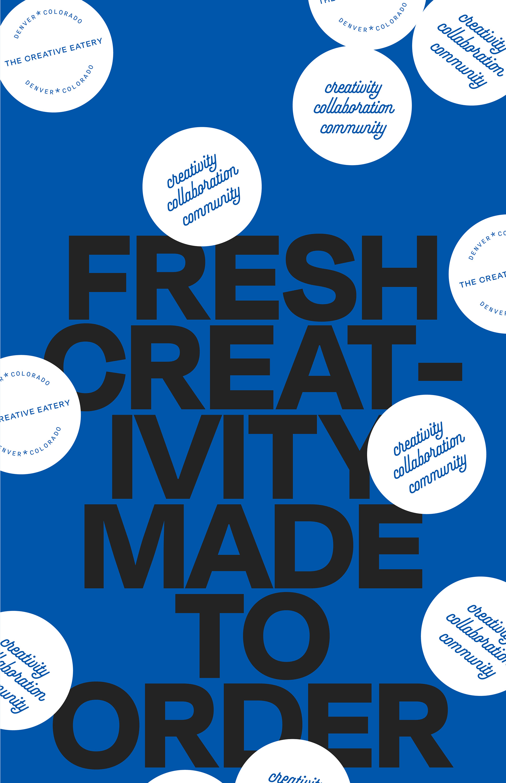
Serving creativity, fresh daily.
This project was pure joy to design. It's playful, bold, and full of personality. When you have fun creating visuals, people have fun interacting with them.
The concept for The Creative Eatery starts with its name: a clever twist on a classic eatery brought into a modern creative space. The brand carries that idea through every detail. A polished script font nods to nostalgic signage, while a clean sans serif balances it with contemporary simplicity.
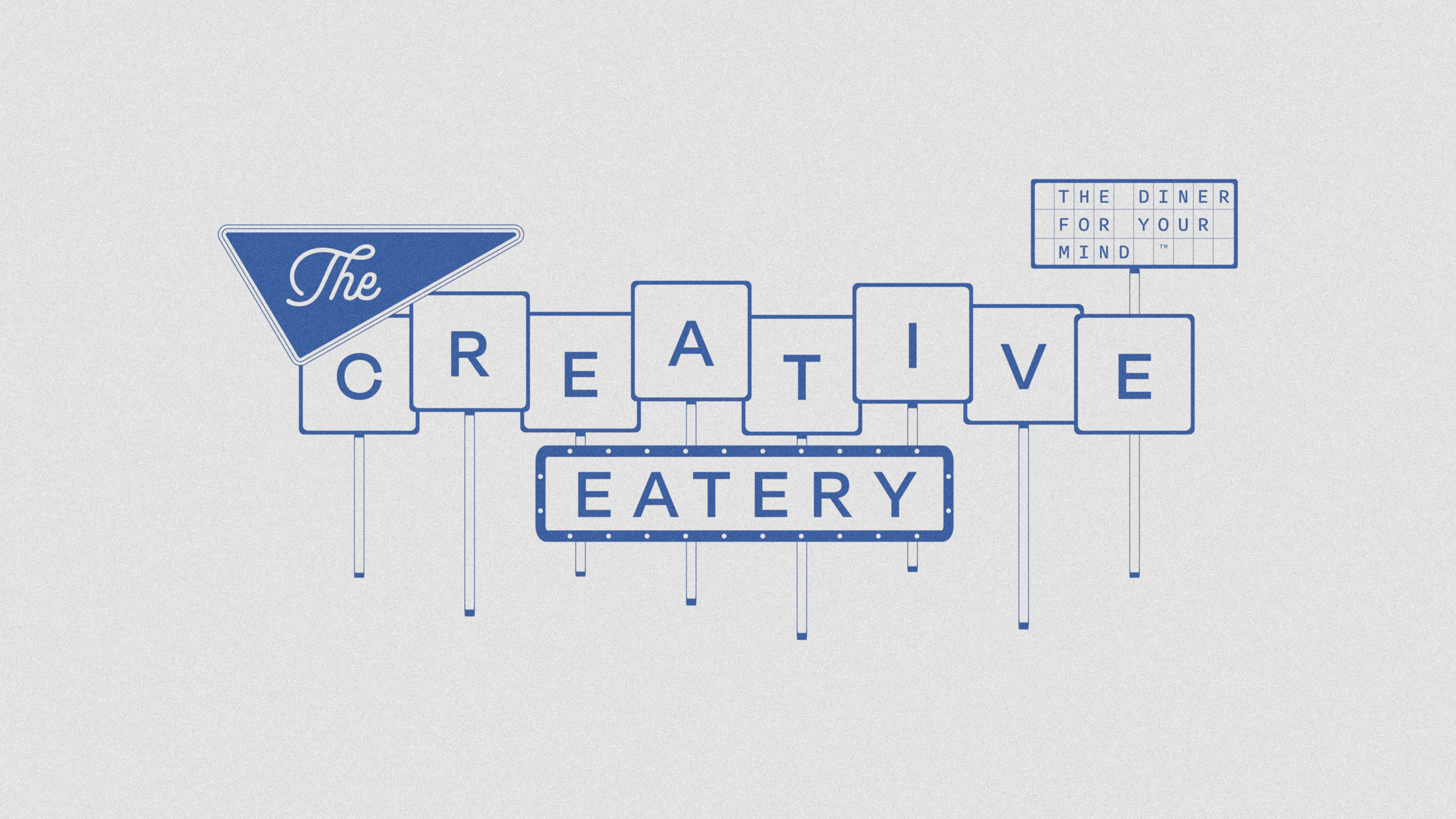
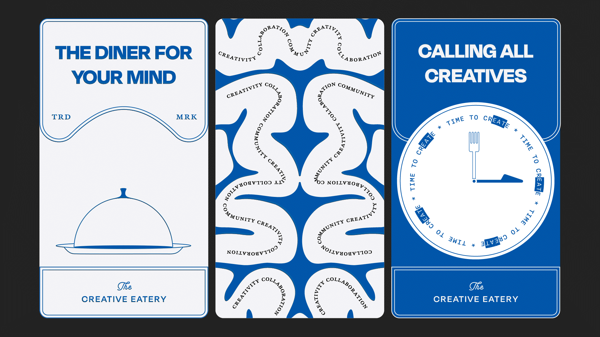
I also designed a playful diner-style sign for both print and digital assets, with plans to bring it to life through motion in the next phase.
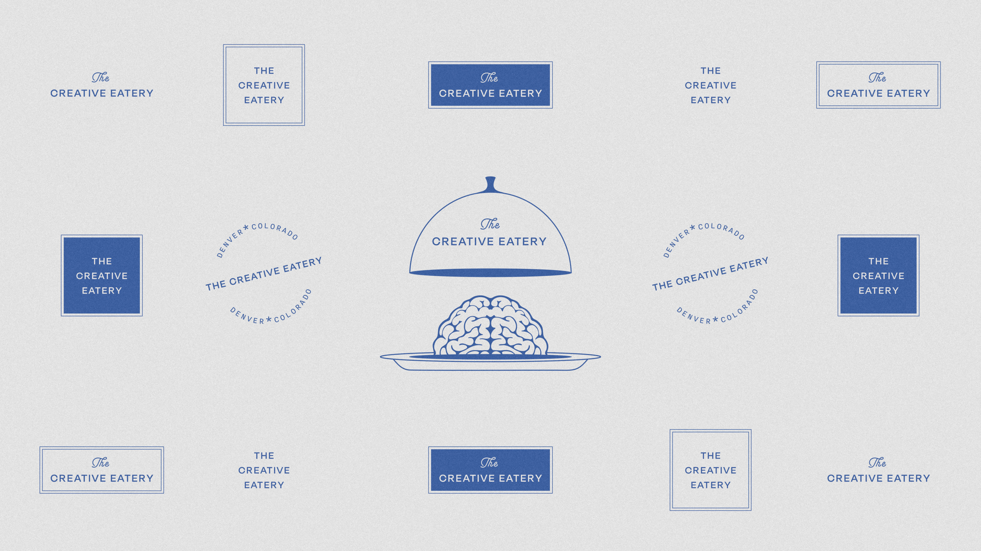
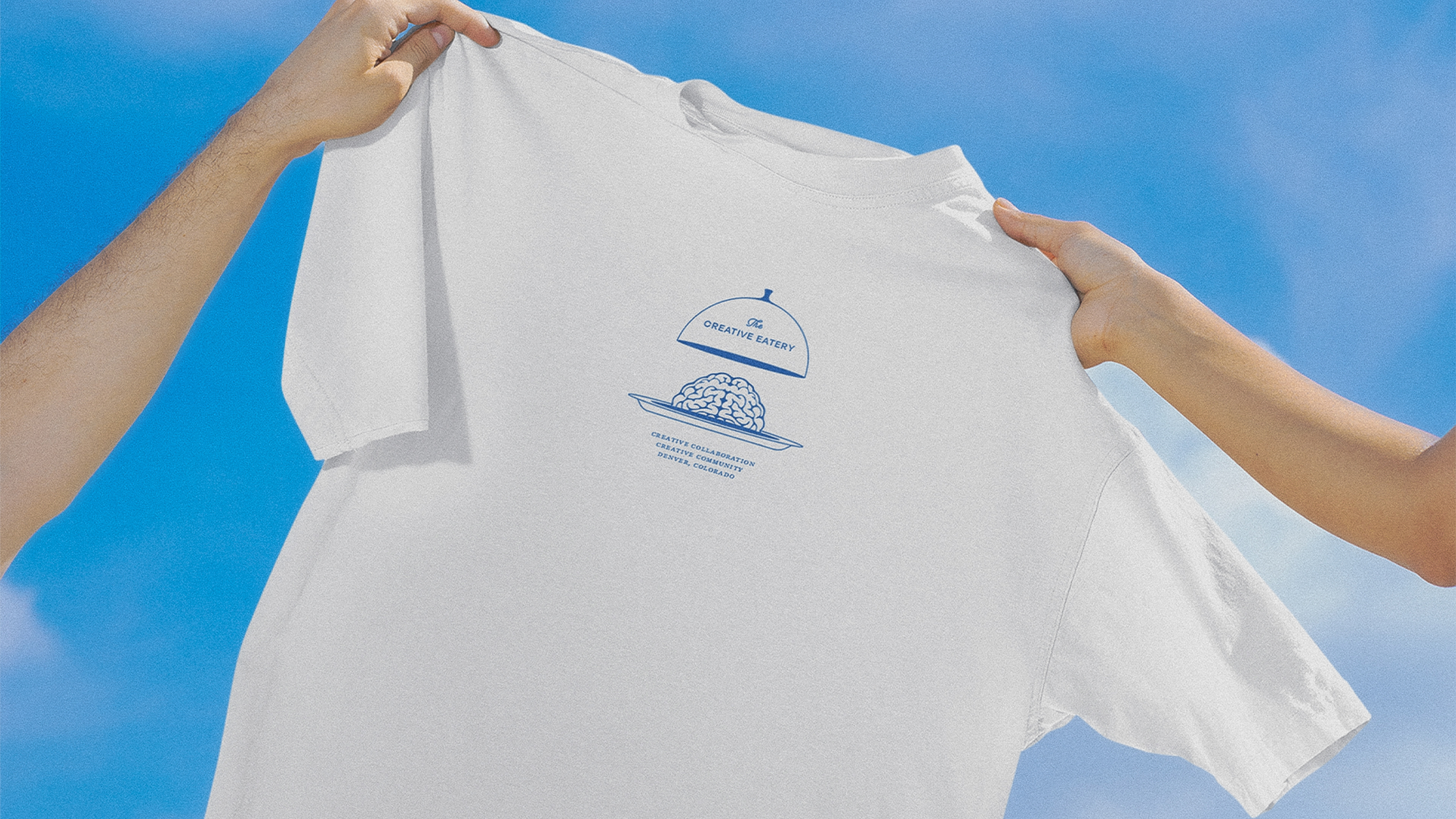
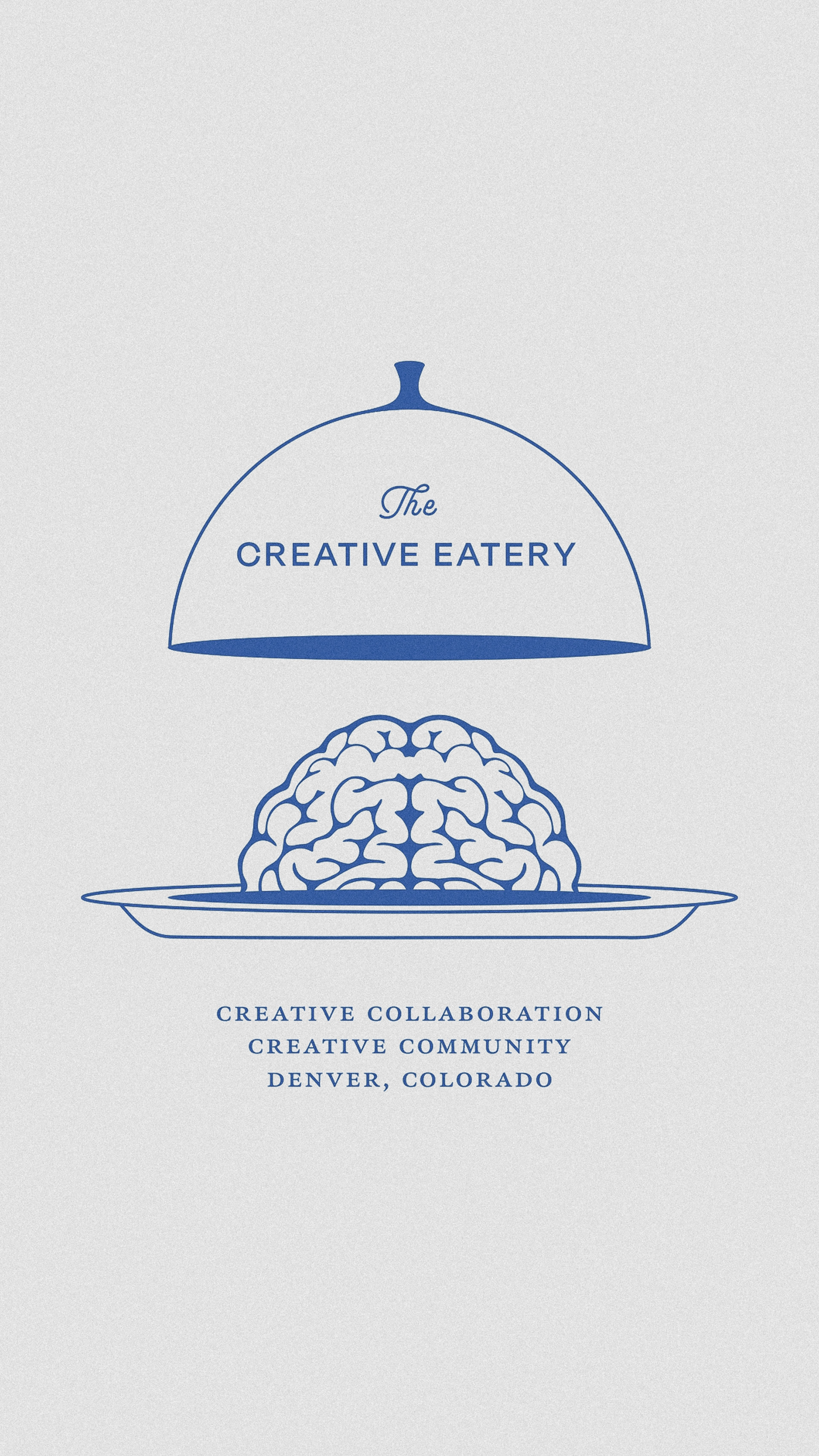
A cloche with a brain underneath? Yes please.
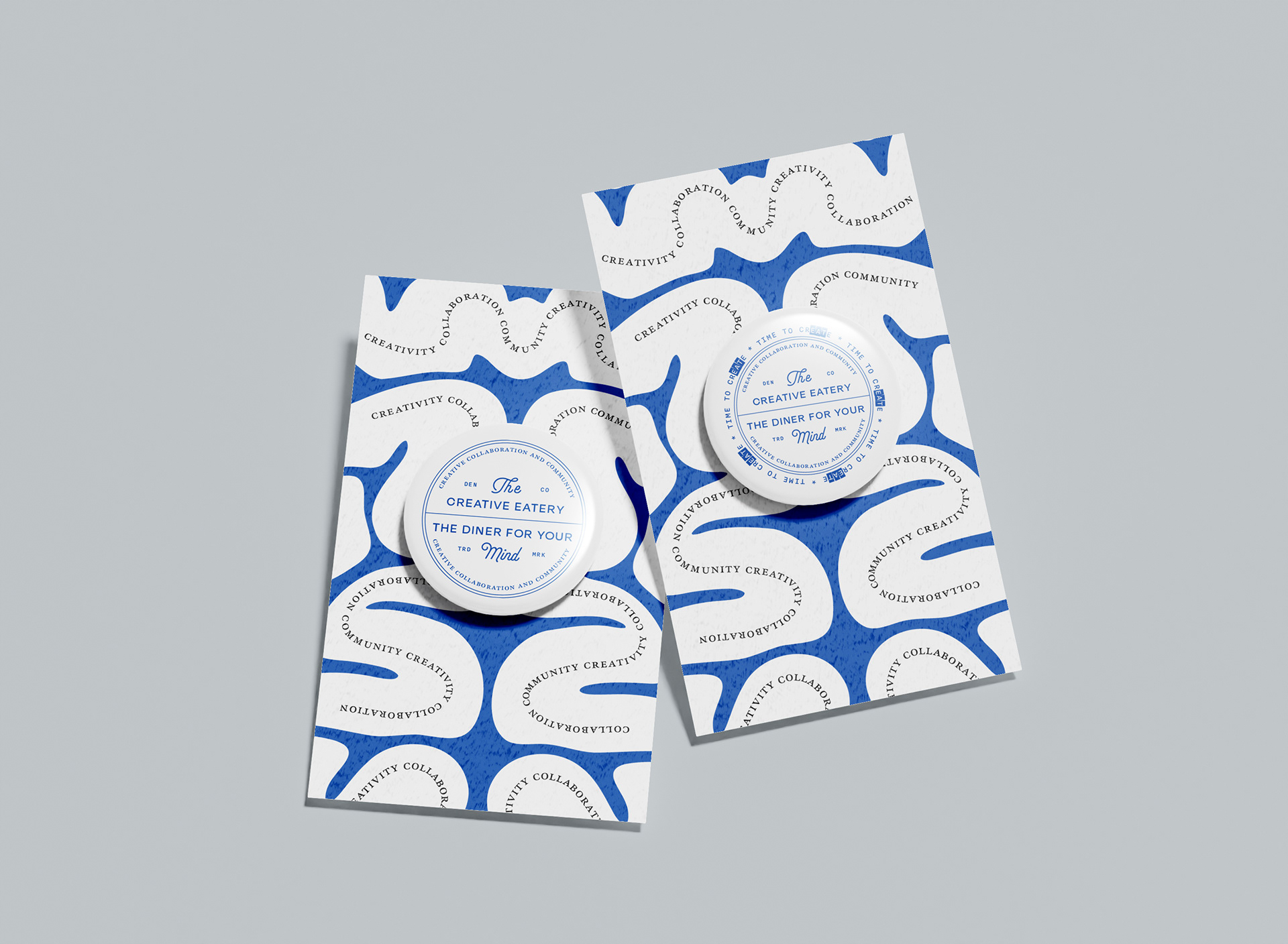
At The Creative Eatery, it’s all about the mind. Creativity starts within but grows stronger through collaboration. I kept returning to the phrase, “Two minds are better than one,” and built the identity around that spirit. The brain graphic serves as a core design element; first as a detailed logo variation, then as a custom pattern used across brand materials.

Insane in the membrane.
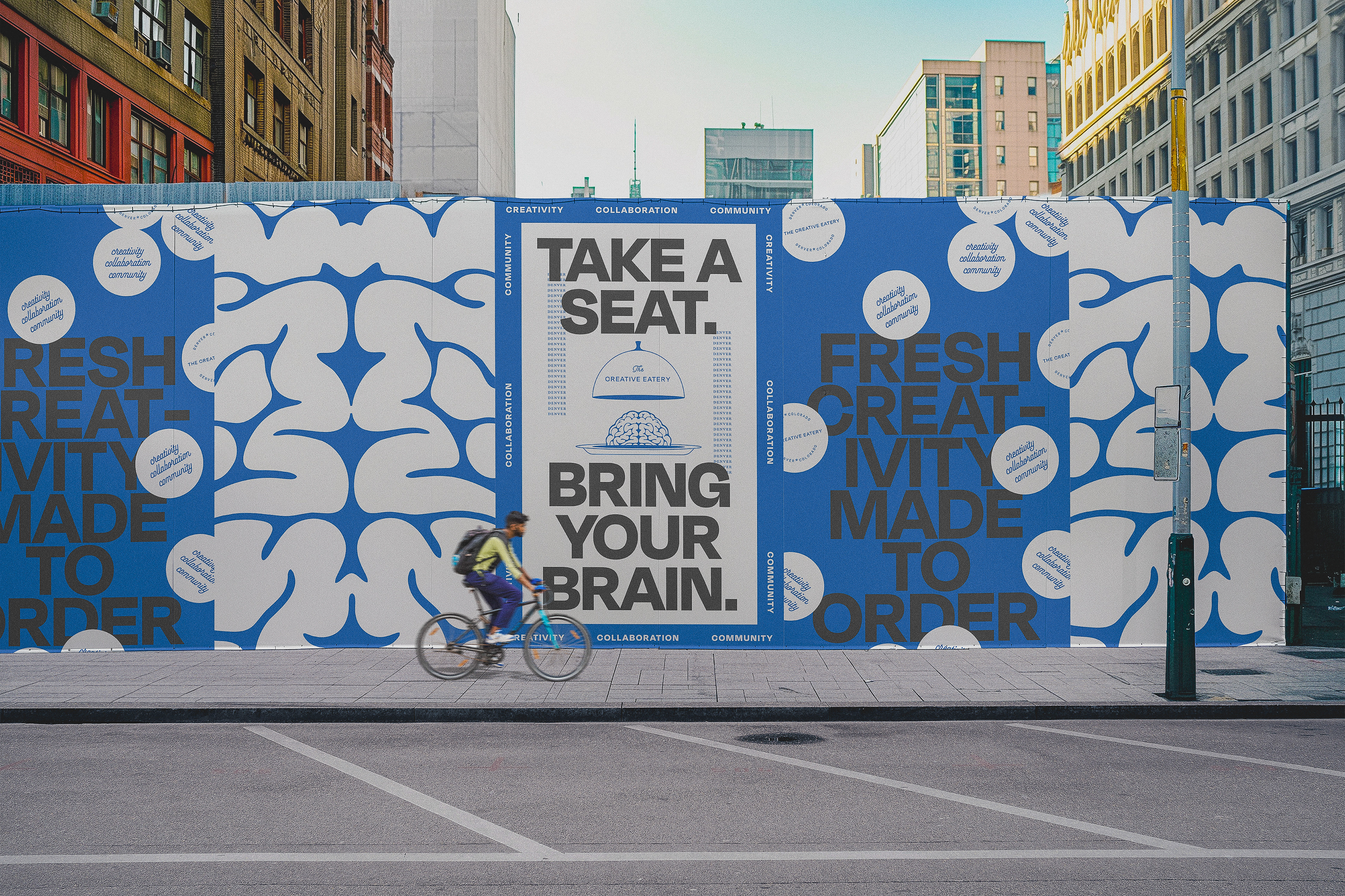
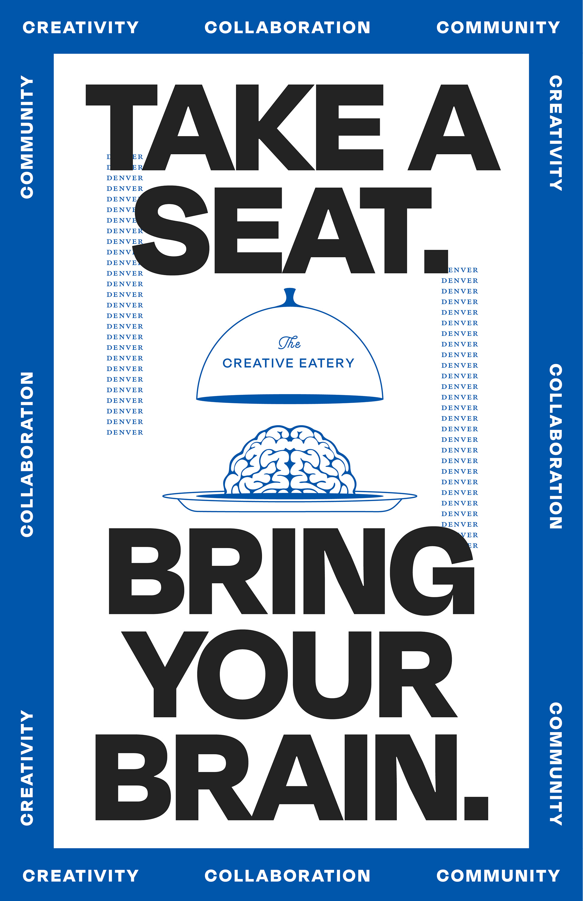
The brand relies on a single accent color to tie its many expressions together. Layering different graphic elements in this color created a cohesive yet vibrant system that feels dynamic and alive.
A zoomed-in version of the brain illustration serves as a striking visual break between advertising messages. It captures that sense of creative chaos and passion that fuels every artist.
Classic inspiration, reimagined.
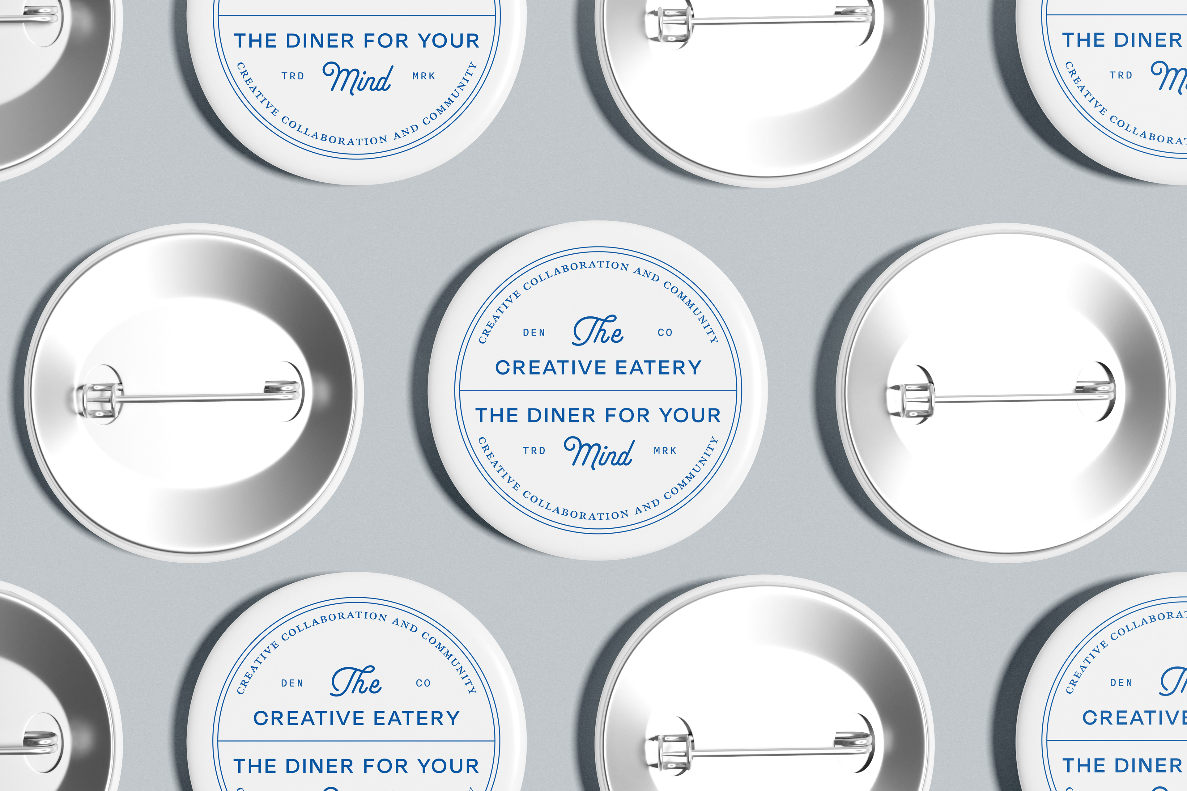
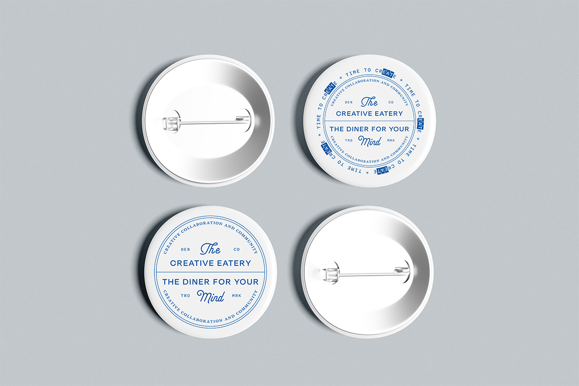
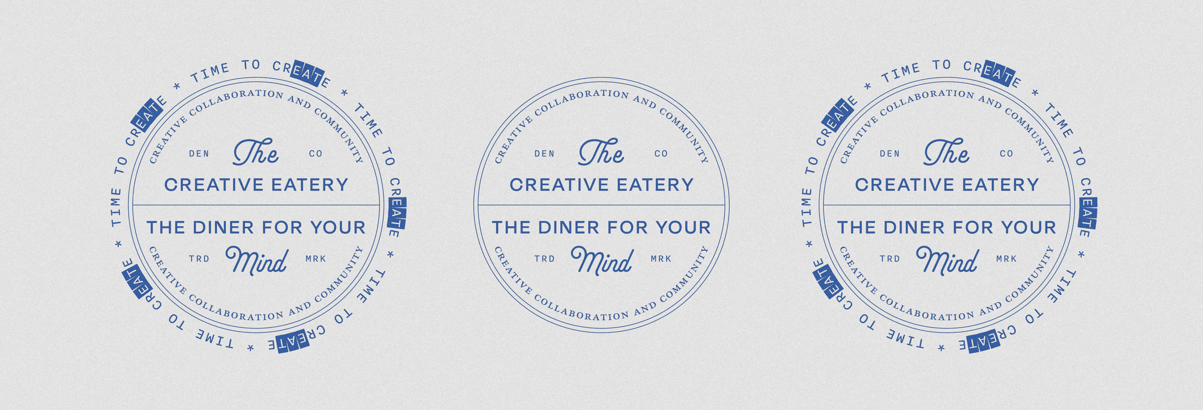
To complete the identity, I designed two badge variations. One is clean and minimal and the other plays with the tagline “Time to create.” The design resembles a classic watch face; a subtle nod to both the eatery’s timeless charm and the importance of making time for creativity.
The phrase itself carries a hidden layer of meaning, combining create and eat within the same word. It’s a small but intentional detail that brings the entire concept full circle.