Organic by design.
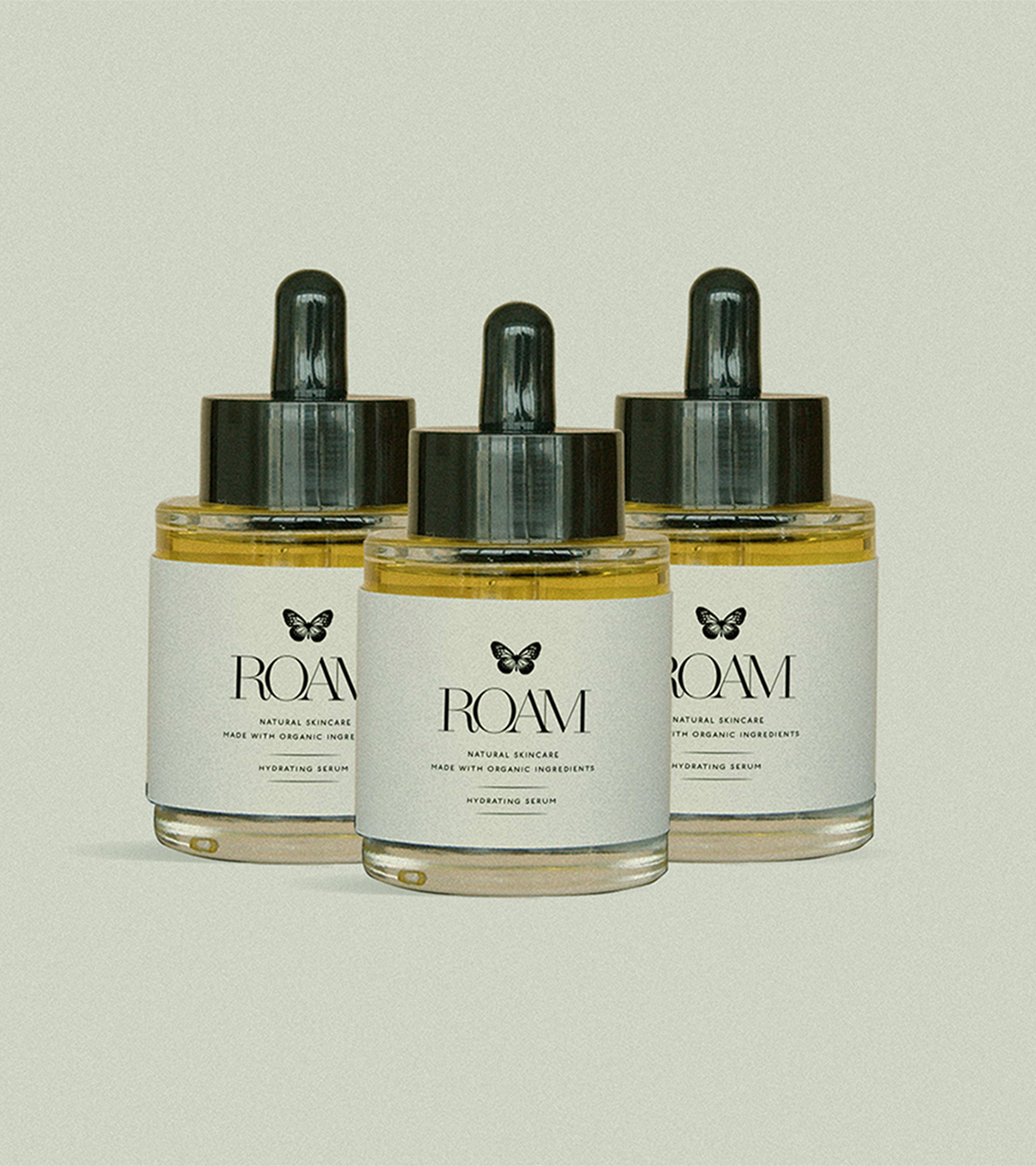
Roam is a natural skincare brand centered on clean, organic ingredients. Sustainability is at the heart of the company, from environmentally conscious packaging to ethically sourced ingredients. The brand’s mission is to nurture both skin and planet, offering products that are simple, effective, and luxurious.


Metamorphosis.
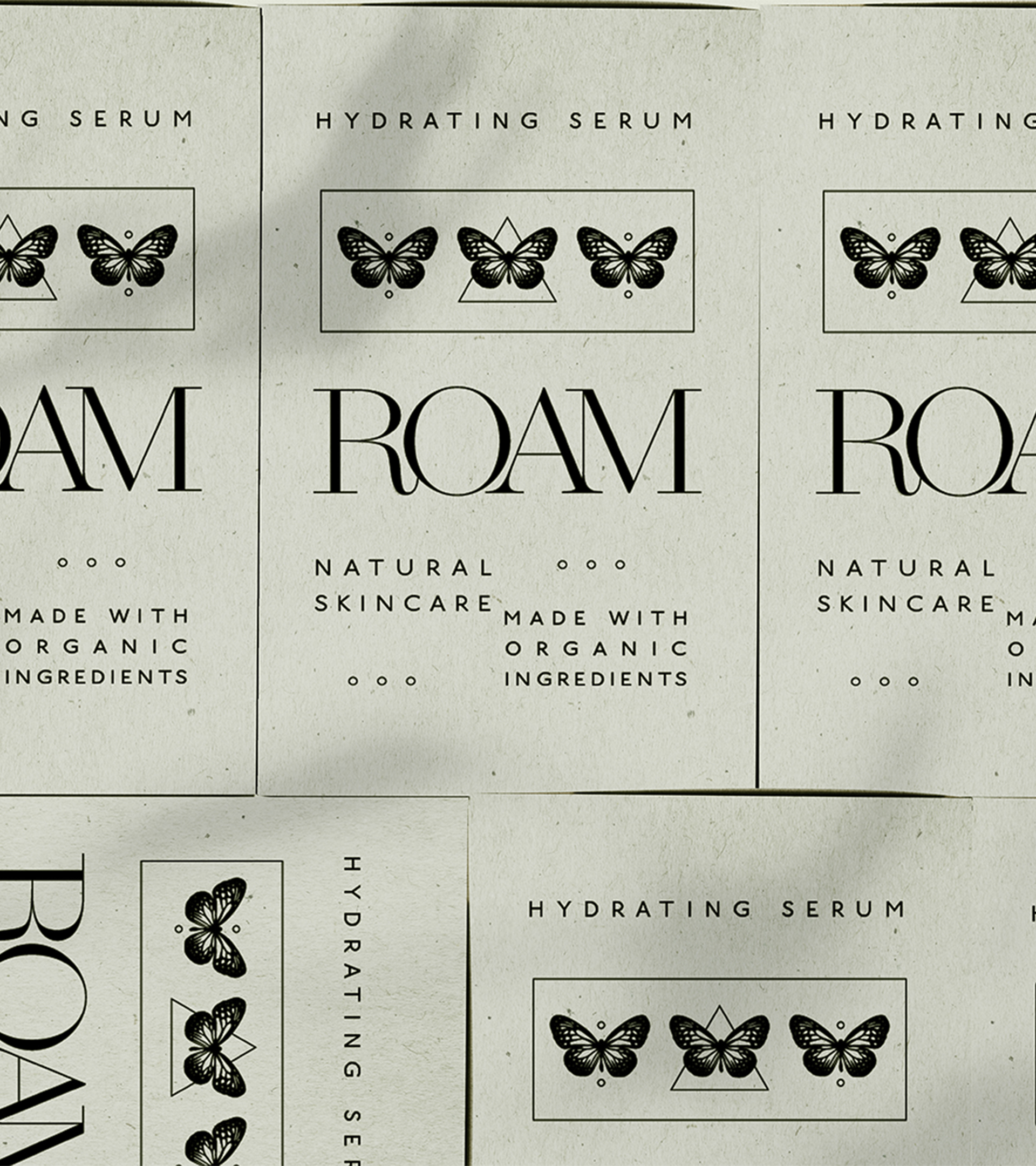
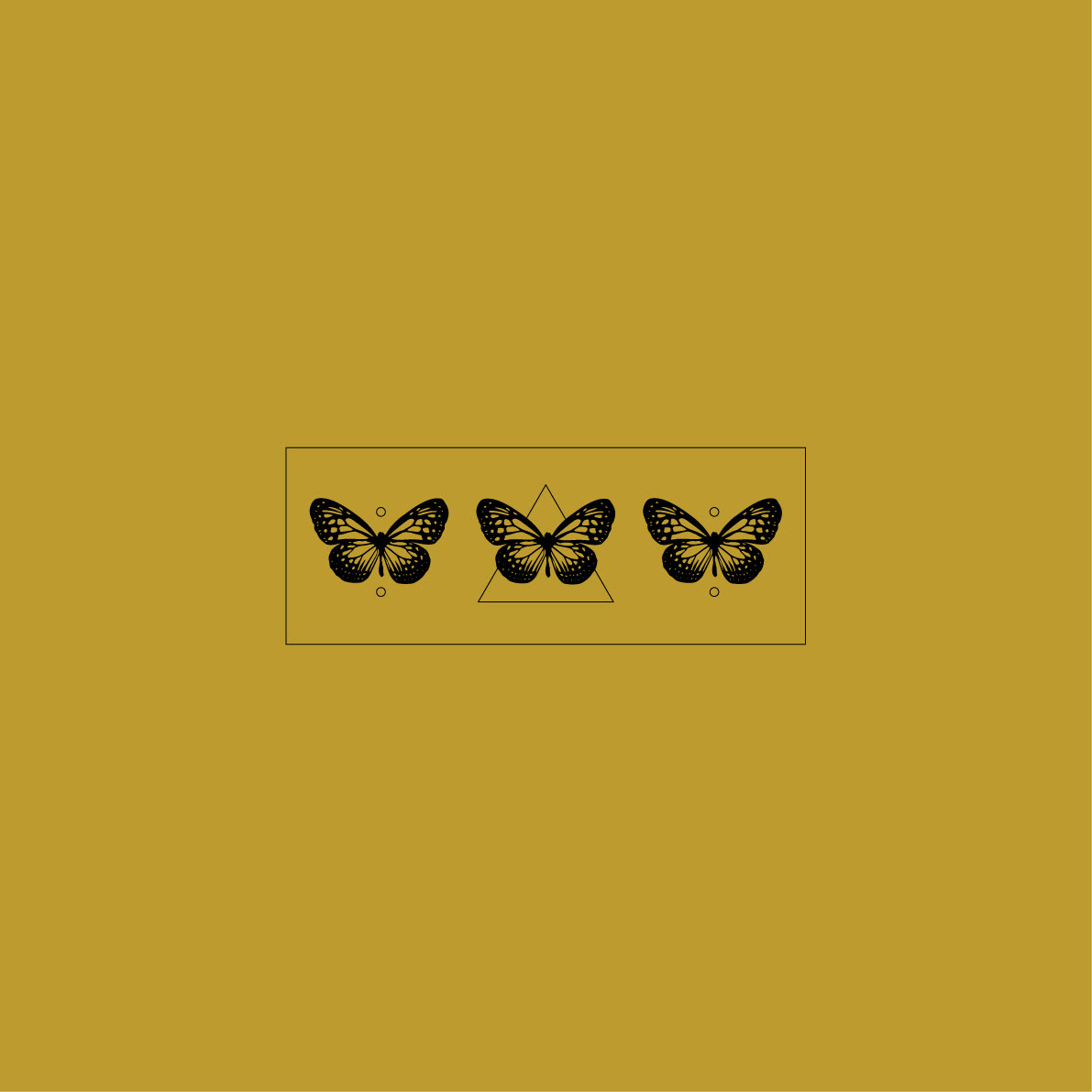
Butterflies were incorporated as subtle visual elements to reinforce the brand’s values. They symbolize transformation, natural beauty, and renewal. This mirrors the transformative power of Roam’s skincare. In the design, these motifs appear delicately in packaging and supporting graphics, adding movement and life while maintaining a clean aesthetic.
Minimal, Meaningful, Memorable.
The primary logo is set in a refined Didone typeface, chosen for its elegance and clarity. Its high-contrast strokes and timeless proportions convey sophistication while remaining minimal, allowing the natural imagery to shine.


Golden Hues.
The golden yellow accent color reflects the natural tones of Roam’s products, reinforcing a sense of warmth, vitality, and wellness. It adds a subtle pop to the identity while maintaining the brand’s sophisticated, clean aesthetic. Used sparingly across packaging and supporting graphics, this accent draws attention to key details and highlights the product’s natural, organic qualities.