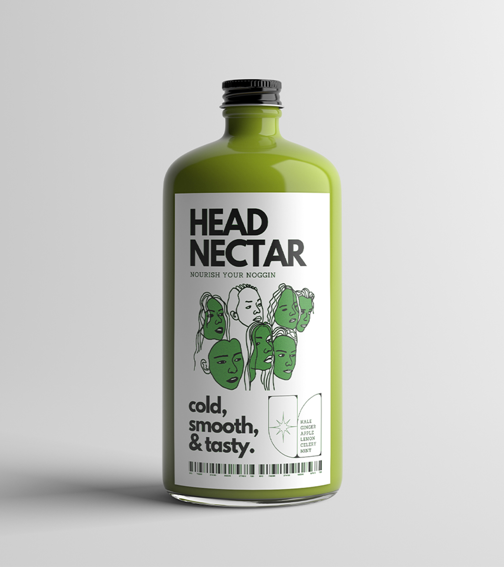
Nourish your noggin.
The name says it all. Head Nectar makes healthy juice feel edgy and exciting. With straightforward ingredients and no filler, it’s as honest as it is refreshing.
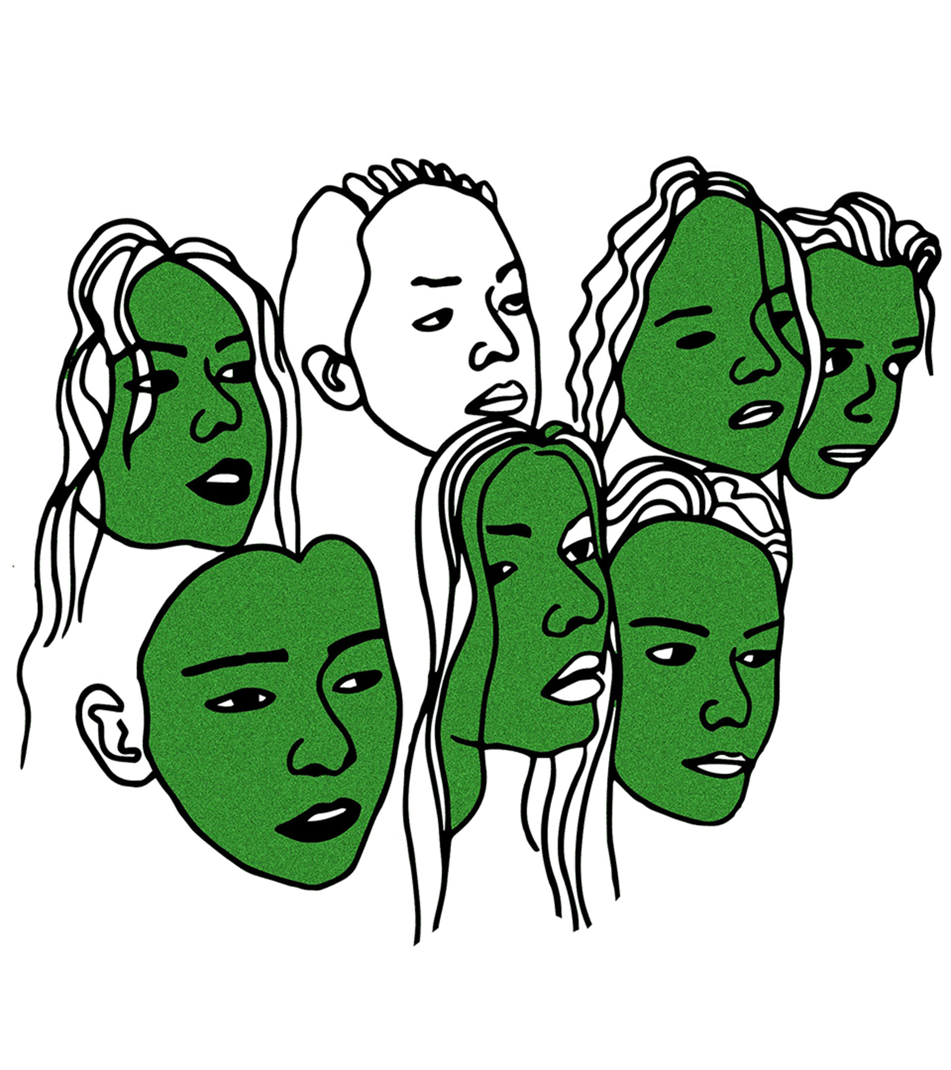
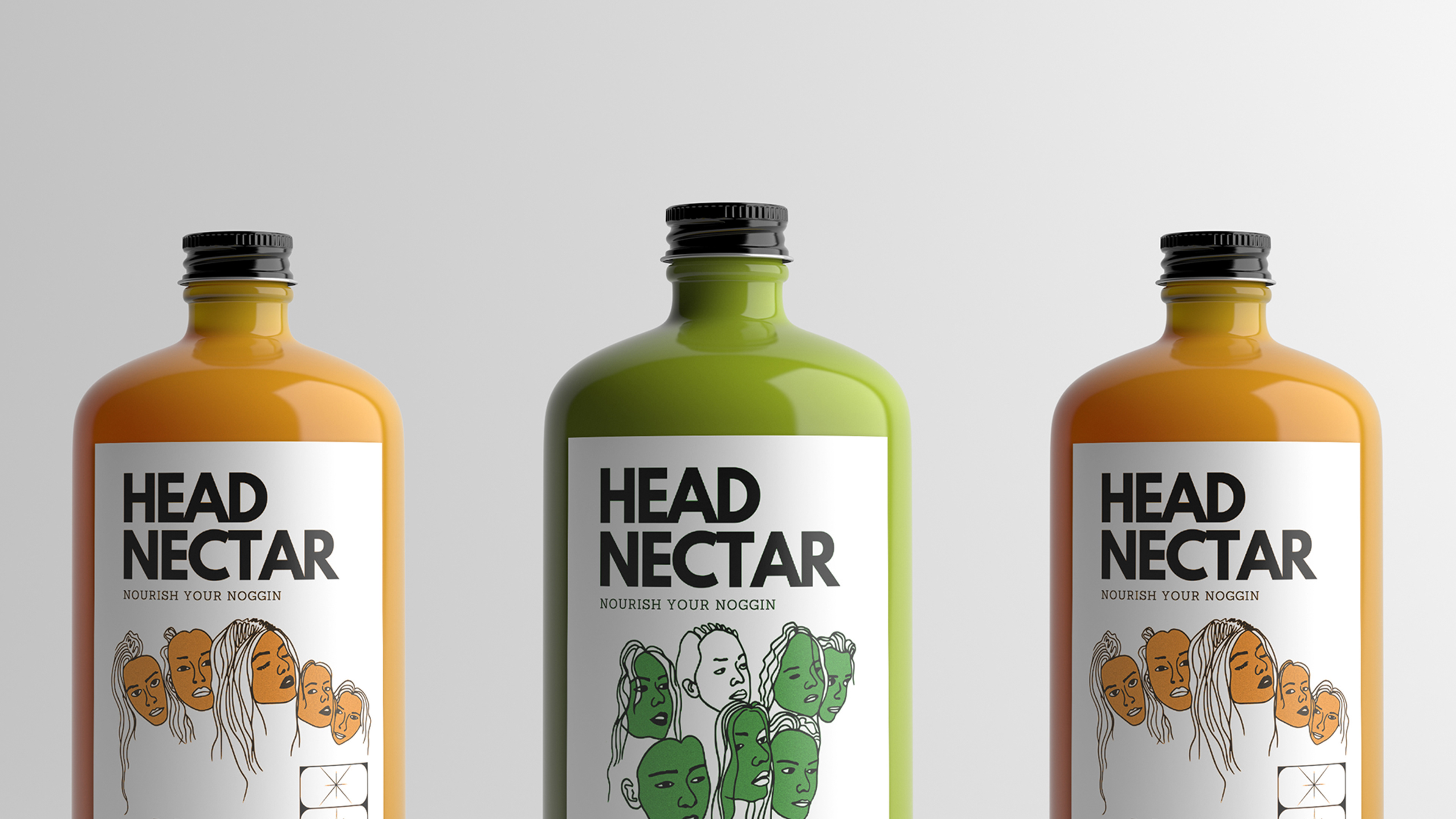
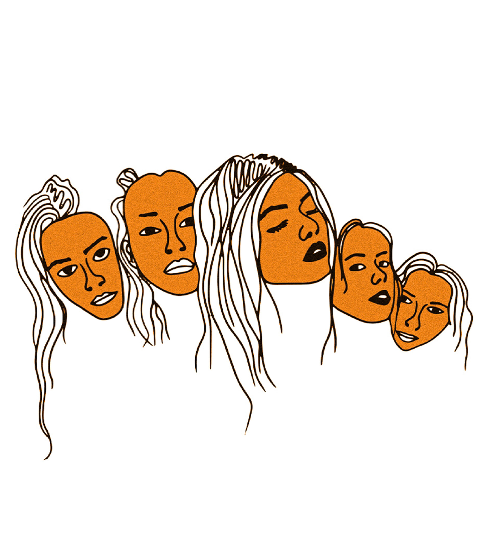
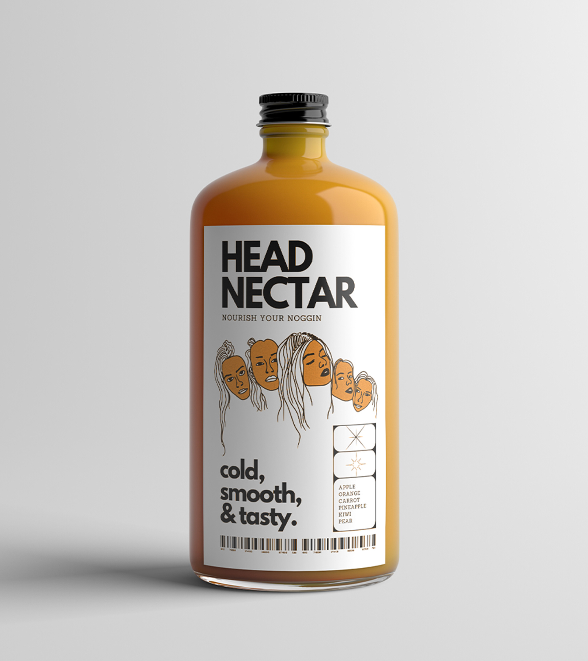
Meet the faces.
Each packaging design centers around a custom, quirky illustration of a head whose face matches the color of the juice inside. The illustrations are intentionally imperfect and hand-drawn, setting a playful tone that makes Head Nectar instantly recognizable and refreshingly human.
Familiar, with a twist.
The illustrated faces remain the focal point across all packaging while staying flexible enough to adapt. Each label keeps the same visual style and aesthetic, but the positioning shifts to make room for other design elements like the ingredient list. This consistency through variation creates a unified brand system that feels cohesive, vibrant, and alive.